Quick jump to a project…

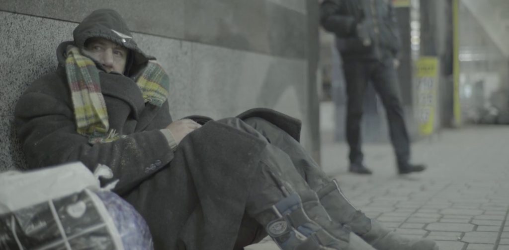
The misrepresentation of street homeless has created mental barriers preventing the general public from helping them.
Homeless people want others to recognize and treat them as equal. Their misrepresentation in the media is not always the case from person to person. Street homeless are doubtful that “normal” people will help them because of the concern of safety.
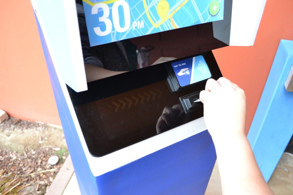
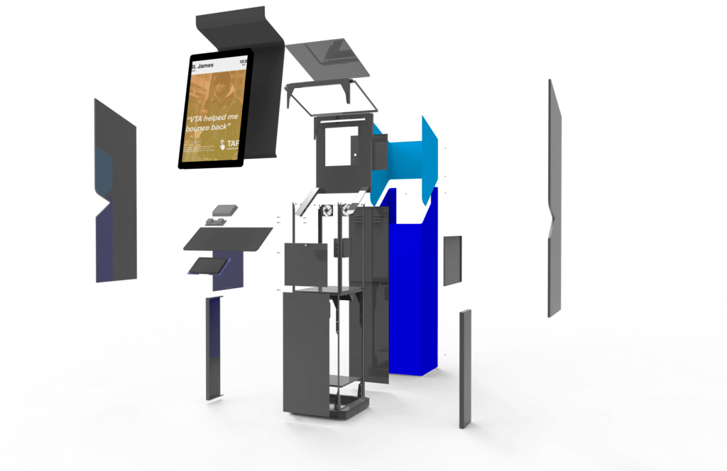
Our team decided to create a device that benefits both the general public and homeless communities. With this device, we can educate the general public on homeless people’s situations and provide a way for them to connect and help each other out.

Responsible for much of the User Interface design.

Responsible for interviewing and storyboarding.
Responsible for CAD design and production.
(San Jose / Santa Clara County)
(San Jose Census 2017)
(San Jose 2017 Census)
The misrepresentation of street homeless has created mental barriers preventing the general public from helping them. Our group was very apprehensive heading into this project but what got us on board were those initial contact we had with the street homeless; not only did we talk to them with an open, instead of a closed, mind we also got them to be stakeholders / mentors in our creative process. Anyone who has the time to genuinely have a conversation with a person living on the streets will quickly realize that, “they are people too”.
Our original direction was aimed at bringing both homeless and “rest of the public” together through means of communal actives such as eating, charging devices, or playing games. However, this logic merely provided a new space for the same stereotypes to be reinforced. It wasn’t until interviewing with our target audience did we realize that education and safety were of higher importance.
The misrepresentation of street homeless has created mental barriers preventing the general public from helping them.
The city of San Jose is one of the largest cities in the Bay Area; public spaces can be found here in all shapes and sizes. initially, we were drawn towards designing for parks because it is a commonly shared place of leisure and recreation among members of the community. Roosevelt Park was most lucrative to us at the time because of its location, foot traffic, and amenities (skate park, bbq pits, recreation center etc.).
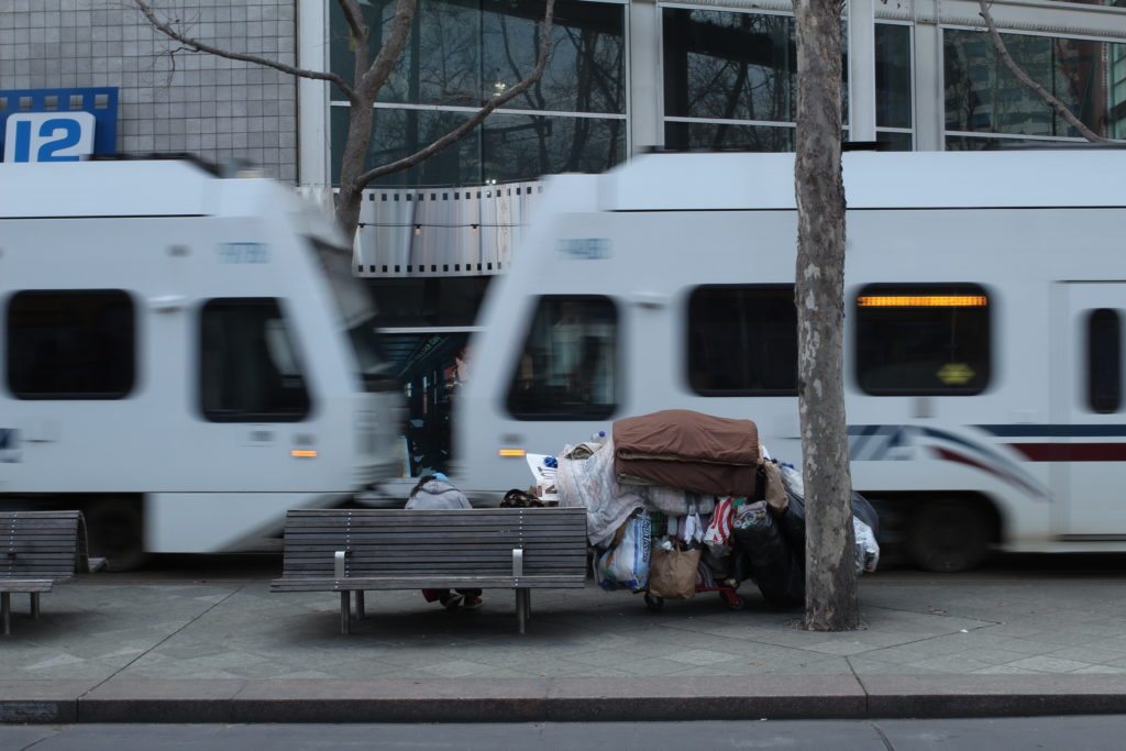
What does that even mean? Well, with there new rebrand and the expected completion of the BART, VTA transportation is trying to improve its relationship and take proactive steps toward helping everyone in the community who depends on it—starting with those who are in the most need. VTA will be partnering with non-profits to donate free rides to prescreened individuals who are on the borderline of being homeless and just need a little bit of help to get back on their feet.

Actually getting in front of the people we are designing for proved to be an invaluable experience. Their grounded perspective switched us from thinking about the physical product we’d be designing to the experience of breaking down social barriers that currently roadblock change.
Certain elements were given a spring animation treatment while others nicely faded in and out; these design decision came from the feedback of users who walked through the initial Principle prototype.